An article from PaperSpecs

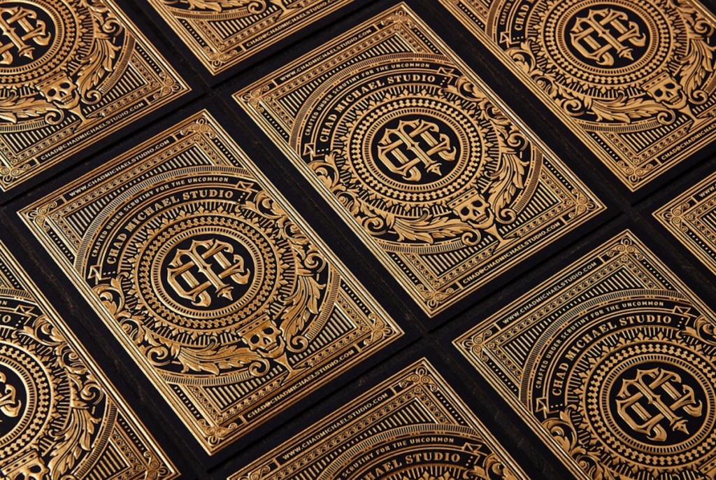
I can count on one hand the number of designers whose work I’ve fallen in love with based purely on their business card: Chad Michael is at the top of that list. Its devilishly intricate foil details and grinning skull-like grail are more in keeping with some mythical talisman than a simple calling card. It is precisely this mix of thoughtful sophistication and otherworldly iconography that makes Chad’s work seem both fresh and new, as well as gloriously historic. His bold choice of typography only enhances this feeling.

1. What other designer or designers truly inspire you?
I have a sincere amount of admiration for the design work of Jordan Metcalf, Josh Emrich, Steve Wolf, and Curtis Jinkins to name a few. But I would say a large amount of what inspires me does not come from other designers’ work. A majority of what fuels me are designs from the past, unusual illustrators such as Madeline von Foerster, textile design, and book covers.
2. Of all the different papers out there, what is your absolute favorite?
That’s a tough one! The paper book room here in the studio is quite large and I’m always going through periods of being in love with a new stock. At the moment the Allure line has caught my eye. For letterpress printing I’ve been diving into the Gmund stocks [Get Swatchbook].
3. When the ideas just aren’t coming, do you have a particular thing you do or place you go to get the creative juices flowing?
I have a variety of things I’ve learned that work fairly well for me when I’m not feeling inspired or when the brain just won’t work. The big thing is physical exercise. Exercising to the point of exhaustion usually lifts that fog around my thinking. For times when I’m not feeling super inspired, I dig through my visual archives and sketch out ideas for brands that don’t exist.

4. What is your favorite printing technique?
I am a sucker for foiling. I think that is obvious in my work but over the past year I’ve really been trying to get farther and farther away from what makes me comfortable. As of late I’ve been playing around with blind embossing, holographic foils and metallic inks.
5. Do you have a favorite type of project to work on?
I have two big enjoyments when it comes to design. One is package design and the other is stationery. But alas I don’t get to produce stationery for clients as much as I would like.
6. Is there a piece of packaging that you’ve come across that you absolutely love? And if so, why?
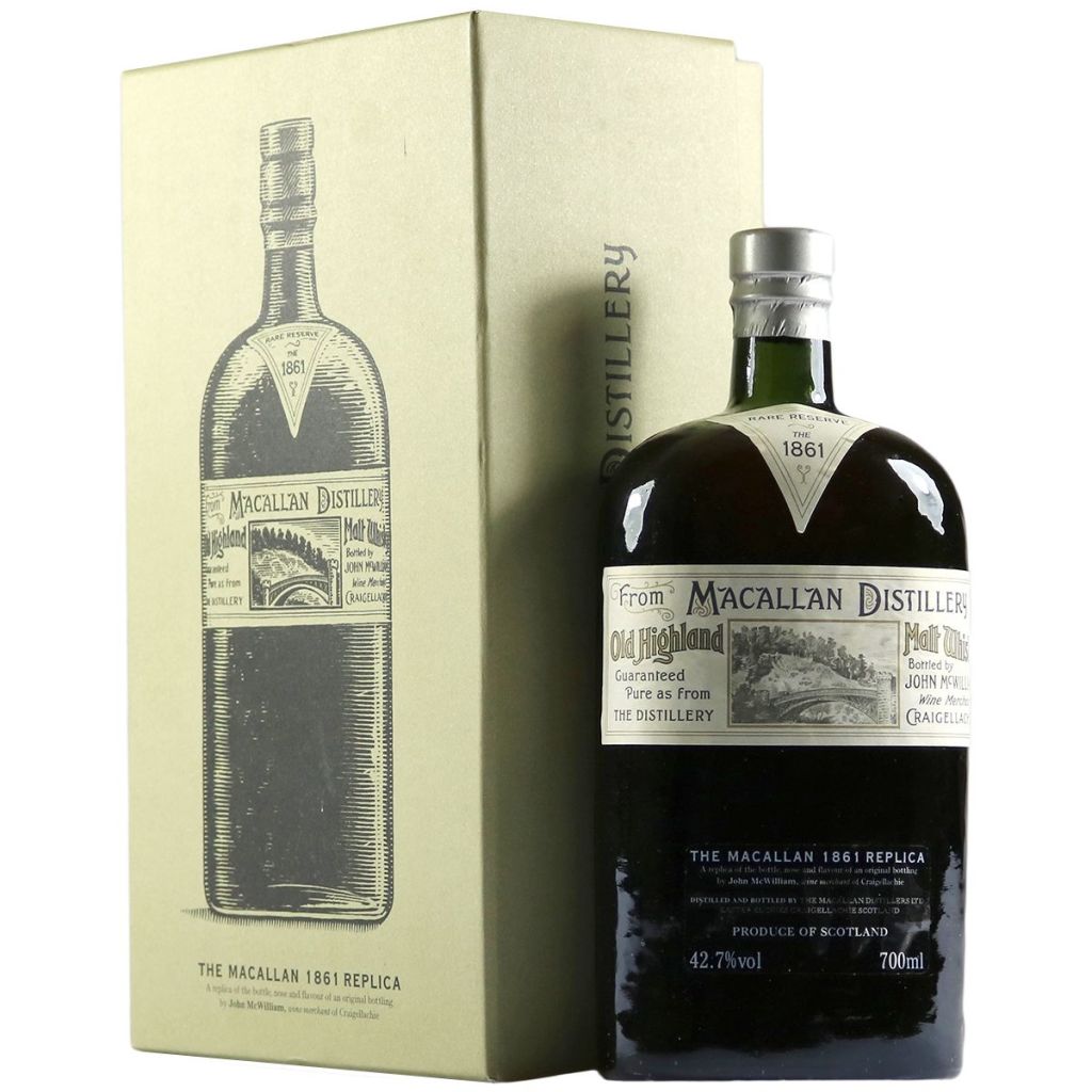
This past year: Macallan Malt Whiskey produced an 1861 Replica design that I really find successful. It has a gorgeous dead-leaf bottle with a hand-blown glass texture. The label isn’t overworked and has some beautifully set typography. [See below.]

Click the link below to see the other four inspirations.
read more/source: https://www.paperspecs.com/paper-news/top-10-inspirations-chad-michael/
