A Lovely Redesign from Krispy Kreme and Device Creative
On July 13, 1937 the first Krispy Kreme kitchen opened in Old Salem, North Carolina. Founder Vernon Rudolph purchased the still-used secret yeast doughnut recipe from a French chef in New Orleans and began selling the pastries to local grocery stores.
The smell from the kitchen was so enticing to passers-by that Rudolph decided it was in his company’s best interest to start selling the doughnuts directly to customers on the street. So, he cut a hole in one of the building’s outer walls and started selling doughnuts directly to customers on the street. Seven years later in 1944, the doughnut display cases we’re so familiar with today were brought into Krispy Kreme stores for the first time.
The doughnut’s secret recipe and display cases aren’t the only staples to the Krispy Kreme world. The logo designed by Benny Dinkins, a local architect at the time, has been by Krispy Kreme’s side for 80 years now.
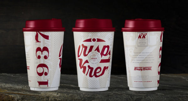
Something that did get a recent update? The classic Krispy Kreme coffee cup. In a February press release, the company announced total update to their coffee, now offering a rich blend and a smooth blend. To help promote the change, Krispy Kreme paired up with North Carolina-native creative team Device to bring a little buzz back to the coffee.

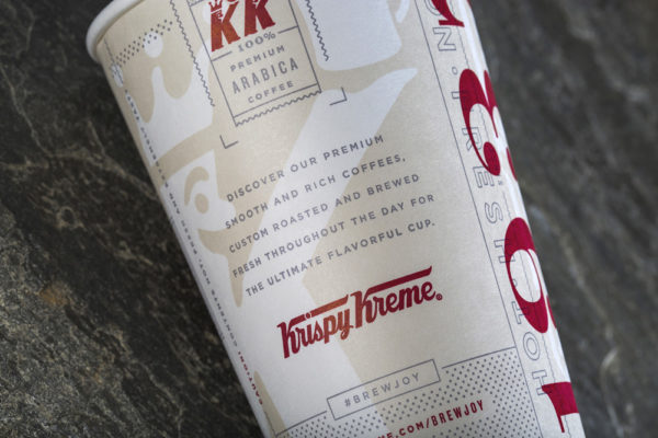
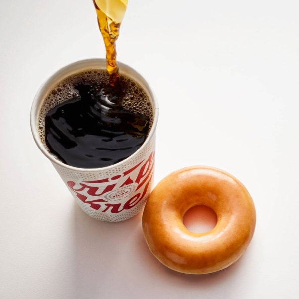
From Device: Everyone knows Krispy Kreme for their doughnuts. Coffee? Not so much. Even though it’s been part of their brand since the beginning, Krispy Kreme approached Device to help re-introduce their coffee beverage platform to consumers by re-designing their iconic coffee cup. They had re-formulated their entire coffee platform to go perfectly with their doughnuts, so wanted to move away from the dominant green and big logo for a distinctive approach that would signal to the consumer that their coffee was new and different.
The design objective for the cup was to communicate 5 things: coffee, premium quality, fresh, authentic and crafted. The cup also needed to work on its own while relating to what everyone already loves about Krispy Kreme: their delicious doughnuts. Since many people order their morning coffee through the drive-thru with only that one touch point to the brand, we decided to tell the story visually and verbally.
Our solution was to incorporate elements from Krispy Kreme’s 80-year heritage, bringing authenticity to more than just their doughnuts, and create a fun experience that would get noticed by consumers and entice them to switch their coffee preference to Krispy Kreme.


read more/source: http://www.howdesign.com/design-business/krispy-kreme-coffee-redesign/